The brand
Built to
sell.
Every choice — label, profile, format — answers one question: does it help sell? If the answer is no, it doesn't make the range.
Why it exists
Unlike anything the industry is used to seeing.
In the heart of Piedmont, a brand born with one precise goal: to work in the modern market, where what convinces matters more than what sounds nice. Packaging that performs. Accessible yet distinctive wines. Short, clear, repeatable storytelling. Wine told without noise, with substance at the centre.
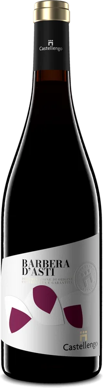
The packaging
Labels that work.
Our labels aren't just beautiful: they're strategic. The double-paper construction becomes a tactile language that communicates solidity, elegance and reliability.
A Castellengo bottle gets noticed. Stands out. Gets remembered. And above all, gets bought.
The wine
Inside the bottle,
the same language as the design.
Fresh.
Drinkable.
Immediate.
Accessible, never ordinary.

The five pillars
Clean, powerful design
Instantly identifiable, in every market and on every shelf.
Concise storytelling
Clear, repeatable, ready for the trade to use in every sales conversation.
Fresh, versatile profiles
Immediate wines that speak to different audiences without losing character.
Coherent, scalable range
From everyday to occasion: one logic, no dispersion.
Solid positioning
Easy placement and consistent perceived value, market after market.